What if you could take your CSS animations beyond simple fades and slides — adding an extra dimension and a bit of old-school animation magic? In this article, pioneering author and web designer Andy Clarke will show you how masking can unlock new creative possibilities for CSS animations, making them feel more fluid, layered, and cinematic.
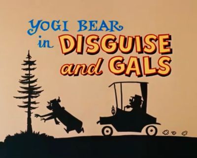
Despite keyframes and scroll-driven events, CSS animations have remained relatively rudimentary. As I wrote in Part 1, they remind me of the 1960s Hanna-Barbera animated series I grew up watching on TV. Shows like Dastardly and Muttley in Their Flying Machines, Scooby-Doo, The Perils of Penelope Pitstop, Wacky Races, and, of course, Yogi Bear.
The Yogi Bear Show, copyright Warner Bros. Entertainment Inc. (Large preview)
Mike loves ’90s animation — especially Disney’s Duck Tales. So, that is the aesthetic applied throughout the design.
Design by Andy Clarke, Stuff & Nonsense. Mike Worth’s website will launch in June 2025, but you can see examples from this article on CodePen. (Large preview)
I used animations throughout and have recently added an extra dimension to them using masking. So, to explain how this era of animation relates to masking in CSS, I’ve chosen an episode of The Yogi Bear Show, “Disguise and Gals,” first broadcast in May 1961. In this story, two bank robbers, disguised as little old ladies, hide their loot in a “pic-a-nic” basket in Yogi and Boo-Boo’s cave!
What could possibly go wrong?
The Yogi Bear Show, copyright Warner Bros. Entertainment Inc. (Large preview)
What’s A Mask?
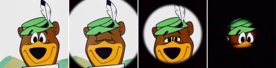
One simple masking example comes at the end of “Disguise and Gals” and countless other cartoons. Here, an animated vignette gradually hides more of Yogi’s face. The content behind the mask isn’t erased; it’s hidden.
The Yogi Bear Show, copyright Warner Bros. Entertainment Inc. (Large preview)
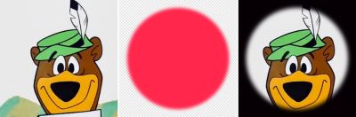
In CSS, masking controls visibility using a bitmap, vector, or gradient mask image. When a mask’s filled pixels cover an element, its content will be visible. When they are transparent, it will be hidden, which makes sense. Filled pixels can be any colour, but I always make mine hot pink so that it’s clear to me which areas will be visible.
The Yogi Bear Show, copyright Warner Bros. Entertainment Inc. Author’s recreation. (Large preview)
A clip-path functions similarly to a mask but uses paths to create hard-edged clipping areas. If you want to be picky, masks and clipping paths are technically different, but the goal for using them is usually the same. So, for this article, I’ll refer to them as two entrances to the same cave and call using either “masking.”
The Yogi Bear Show, copyright Warner Bros. Entertainment Inc. (Large preview)
In this sequence from “Disguise and Gals,” one of the robbers rushes the picnic basket containing their loot into Yogi’s cave. Masking defines the visible area, creating the illusion that the robber is entering the cave.
How do I choose when to use clip path and when to choose mask?
I’ll explain my reasons in each example.
The Yogi Bear Show, copyright Warner Bros. Entertainment Inc. Author’s recreation. (Large preview)
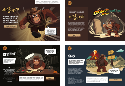
When Mike Worth and I discussed working together, we knew we would neither have the budget nor the time to create a short animated cartoon for his website. However, we were keen to explore how animations could bring to life what would’ve otherwise been static images.
Mike Worth’s website will launch in June 2025, but you can see examples from this article on CodePen. (Large preview)
Masking Using A Clipping Path
On Mike’s biography page, his character also enters a cave. The SVG illustration I created contains two groups, one for the background and the other for the orangutan in the foreground:
I defined a keyframe animation that moves the character from 2000px on the right to its natural position in the center of the frame by altering its translate value:
See the Pen [Mike Worth’s about page (without clip-path) [forked]](https://codepen.io/smashingmag/pen/VYYgYRQ) by Andy Clarke.
See the Pen Mike Worth’s about page (without clip-path) [forked] by Andy Clarke.
While the 50px bounce does add a touch of realism to his movement, I wasn’t happy with how the character’s entrance started at the edge of the viewport.
(Large preview)
I wanted him to become visible at the edge of the illustration instead. As the edges of the cave walls are hard, I chose a clip-path.
There are several ways to define a clip-path in CSS. I could use a primitive shape like a rectangle, where each of the first four values specifies its corner positions. The round keyword and the value that follows define any rounded corners:
clip-path: rect(0px 150px 150px 0px round 5px);
Or xywh (x, y, width, height) values, which I find easier to read:
clip-path: xywh(0 0 150px 150px round 5px);
I could use a circle:
clip-path: circle(60px at center);
Or an ellipse:
clip-path: ellipse(50% 40% at 50% 50%);
I could use a polygon shape:
clip-path: polygon(...);
Or even the points from a path I created in a graphics app like Sketch:
clip-path: path("M ...");
Finally — and my choice for this example — I might use a mask that I defined using paths from an SVG file:
clip-path: url(#mask-cave);
To make the character visible from the edge of the illustration, I added a second SVG. To prevent a browser from displaying it, set both its dimensions to zero:
(Large preview)
This contains a single SVG clipPath. By placing this inside the defs element, this path isn’t rendered, but it will be available to create my CSS clip-path:
I applied the clipPath URL to my illustration, and now Mike’s mascot only becomes visible when he enters the cave:
#cave {
  clip-path: url(#mask-cave);
}
Try this yourself:
See the Pen [Mike Worth’s about page (with clip-path) (without clip-path) [forked]](https://codepen.io/smashingmag/pen/oggmgKp) by Andy Clarke.
See the Pen Mike Worth’s about page (with clip-path) (without clip-path) [forked] by Andy Clarke.
Tip: Implement that code, and you’ll notice there’s a problem when resizing a browser window. While my cave illustration is flexible, the clipPath remains a fixed width.
To make clipPath responsive, add clipPathUnits="objectBoundingBox" to the opening tag, then apply two scale values to the transform property. To calculate these values, divide 1 first by the SVG’s width and then by its height. My SVG’s width is 1400px, which produces the first scale value, 0.0007142857143.
Clipping Irregular Shapes
I often need to change or alter illustrations — perhaps by overlaying colours or applying blending modes — but I want to retain their overall shape.
(Large preview)
While a clipPath will give me the result I’m looking for, the complexity and size of these paths can sometimes negatively affect performance. That’s when I choose a CSS mask as its properties have been baseline and highly usable since 2023.
The mask property is a shorthand and can include values for mask-clip, mask-mode, mask-origin, mask-position, mask-repeat, mask-size, and mask-type. I find it’s best to learn these properties individually to grasp the concept of masks more easily.
Masks control visibility using bitmap, vector, or gradient mask images. Again, when a mask’s filled pixels cover an element, its content will be visible. When they‘re transparent, the content will be hidden. And when parts of a mask are semi-transparent, some of the content will show through. I can use a bitmap format that includes an alpha channel, such as PNG or WebP:
mask-image: url(mask.webp);
I could apply a mask using a vector graphic:
mask-image: url(mask.svg);
Or generate an image using a conical, linear, or radial gradient:
mask shares the same syntax as CSS backgrounds, which makes remembering its properties much easier. To apply a background-image, add its URL value:
background-image: url("background.webp");
To apply a mask, swap the background-image property for mask-image:
mask-image: url("mask.webp");
The mask property also shares the same browser styles as CSS backgrounds, so by default, a mask will repeat horizontally and vertically unless I specify otherwise:
Mike’s FAQs page includes an animated illustration of his hero standing at a crossroads. My goal was to separate the shape from its content, allowing me to change the illustration throughout the hero’s journey. So, I created a scalable mask-image which defines the visible area and applied it to the figure element:
figure {
  mask-image: url(mask.svg);
}
To ensure the mask matched the illustration’s dimensions, I also set the mask-size to always cover its content:
figure {
  mask-size: cover;
}
(Large preview)
Try this yourself:
See the Pen [Mike Worth’s FAQs (mask-image) [forked]](https://codepen.io/smashingmag/pen/VYYgLed) by Andy Clarke.
See the Pen Mike Worth’s FAQs (mask-image) [forked] by Andy Clarke.
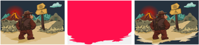
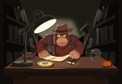
Although “X“ never, ever marks the spot, Mike Worth’s review page illustration sees his orangutan mascot studying his treasure map. I wanted to focus someone’s attention on the center part of the image by using an elliptical shape.
(Large preview)
figure {
  clip-path: ellipse(45% 35% at 50% 50%);
}
However, the hard edges of a clip clip-path don’t create the effect I was aiming to achieve:
Try this yourself:
See the Pen [Mike Worth’s reviews page (ellipse) [forked]](https://codepen.io/smashingmag/pen/dPPaoXK) by Andy Clarke.
See the Pen Mike Worth’s reviews page (ellipse) [forked] by Andy Clarke.
I experimented by combining a Gaussian blur filter with a mask defined in SVG, first by creating the filter, and then applying it to the mask’s ellipse:
And, while this achieved the result I was looking for, the implementation felt over-engineered for what was, after all, a simple effect. By far, the most efficient, elegant, and responsive implementation used a radial-gradient, achieving the effect I was hoping for with no bitmap or vector image and just a single CSS property:
figure {
  mask-image: radial-gradient(ellipse farthest-corner at center center, #000 0%, transparent 75%);
}
Try this yourself:
See the Pen [Mike Worth’s review page (radial gradient mask) [forked]](https://codepen.io/smashingmag/pen/MYYLwjj) by Andy Clarke.
See the Pen Mike Worth’s review page (radial gradient mask) [forked] by Andy Clarke.
This approach enables me to fine-tune my mask-image size and even animate its colour stops, position, and size when someone interacts with its content.
Layering Multiple Masks
Lighting is especially important on Mike Worth’s review page, where his orangutan hero needs it to study his treasure map. Like background images, I can apply multiple mask images to create the lighting I need.
I could combine two mask images: a circular, semi-transparent radial-gradient to provide the ambiance, plus a linear-gradient at a 45-degree angle for the light rays. I applied them both to the figure element:
See the Pen [Mike Worth’s reviews page (layering multiple masks) [forked]](https://codepen.io/smashingmag/pen/myyvJra) by Andy Clarke.
See the Pen Mike Worth’s reviews page (layering multiple masks) [forked] by Andy Clarke.
But, I needed more precise control over the position of the light rays to create the effect that they’re coming from the desk lamp. So, I replaced the linear-gradient with a soft-edged bitmap image:
Finally, to add an extra touch of realism, I added a keyframe animation — which changes the mask-size and creates the effect that the lamp light is flickering — and applied it to the figure:
See the Pen [Mike Worth’s review page (multiple mask-images) [forked]](https://codepen.io/smashingmag/pen/yyyZNba) by Andy Clarke.
See the Pen Mike Worth’s review page (multiple mask-images) [forked] by Andy Clarke.
Animating Masks
Animating CSS masks creates exciting reveals and transitions between scenes and helps someone focus on critical content. It can also bring stories to life, making a person’s experience more engaging and immersive.
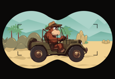
In this deleted scene from my design for his website, the orangutan adventurer mascot I created for Mike Worth can be seen driving across the landscape. To help tell the story that he’s being watched from afar by his archnemesis, I wanted to add a binocular-shaped mask.
(Large preview)
I started by creating the binocular shape, complete with some viewfinder markers.
(Large preview)
Then, I applied that image as a mask, setting its position, repeat, and size values to place it in the center of the figure element:
See the Pen [Mike Worth’s journey animation with binocular-shaped mask [forked]](https://codepen.io/smashingmag/pen/jEEdPLq) by Andy Clarke.
See the Pen Mike Worth’s journey animation with binocular-shaped mask [forked] by Andy Clarke.
However, despite the infinitely scrolling background and the motion of the hero’s bumpy ride, the animation still felt static. So I added a subtle animation that shifts the mask-position, first by creating the keyframes:
Then, I applied it, along with the scrolling background animation, to the figure element:
/* Run both animations simultaneously */
figure {
  animation:
  background-scroll 5s linear infinite,
  pan-mask 6s ease-in-out infinite alternate;
}
After seeing these results, I wondered whether I could connect someone to the story by linking the mask-position to the movement of their cursor. I added a script that selects the figure element, gets the cursor position relative to the viewport, and dynamically changes the mask-position:
Try this yourself:
See the Pen [Mike Worth’s journey animation with binoculars following the cursor [forked]](https://codepen.io/smashingmag/pen/oggmXeM) by Andy Clarke.
See the Pen Mike Worth’s journey animation with binoculars following the cursor [forked] by Andy Clarke.
With that, there was only one challenge left to complete the effect. Focusing binoculars on a distant target is rarely easy, and when the hero’s archnemesis has hands the size of a silverback gorilla, the task is even more challenging. I extended my script to blur the visible content seen through the binocular-shaped mask and then removed the filter when someone presses their keyboard’s spacebar or presses a mouse button:
Try this yourself:
See the Pen [Mike Worth’s journey animation with focussing blur [forked]](https://codepen.io/smashingmag/pen/MYYLwEJ) by Andy Clarke.
See the Pen Mike Worth’s journey animation with focussing blur [forked] by Andy Clarke.
More Masking Animation
When someone using Mike Worth’s website follows the wrong path or takes a wrong turn, he ends up sinking into hot lava.
(Large preview)
To let someone know they might’ve reached the end of their adventure, I wanted to ape the zooming-in effect I started this article with:
I created a circular clip-path and set its default size to 75%. Then, I defined the animation keyframes to resize the circle from 75% to 15% before attaching it to my figure with a one-second duration and a three-second delay:
The animation now focuses someone’s attention on the hapless hero, before he sinks lower and lower into the bubblingly hot lava.
Try this yourself:
See the Pen [Mike Worth’s error page [forked]](https://codepen.io/smashingmag/pen/qEEgdxy) by Andy Clarke.
See the Pen Mike Worth’s error page [forked] by Andy Clarke.
Bringing It All To Life
Masking adds an extra dimension to web animation and makes stories more engaging and someone’s experience more compelling — all while keeping animations efficiently lightweight. Whether you’re revealing content, guiding focus, or adding more depth to a design, masks offer endless creative possibilities. So why not experiment with them in your next project? You might uncover a whole new way to bring your animations to life.
The end. Or is it? …
Mike Worth’s website will launch in June 2025, but you can see examples from this article on CodePen now.


