Joe Maring / Android Authority
You’ve probably heard a lot about the Android 16 QPR1 Beta this week — and for good reason. This newest beta release is our first look at Android 16’s biggest user-facing changes, including the Material 3 Expressive redesign.
I’ve been using the Android 16 QPR1 Beta on my Pixel 9 Pro for the last couple of days, and so far, things are off to an excellent start. Material 3 Expressive is undoubtedly the hallmark feature, but there’s a lot more to this beta than Google’s new design language (as good as it may be).
Here are the six best things in the first Android 16 QPR1 Beta, plus a couple of the beta’s shortcomings.
Have you downloaded the Android 16 QPR1 Beta on your Pixel?
1753 votes
Material 3 Expressive feels incredible
Andy Walker / Android Authority
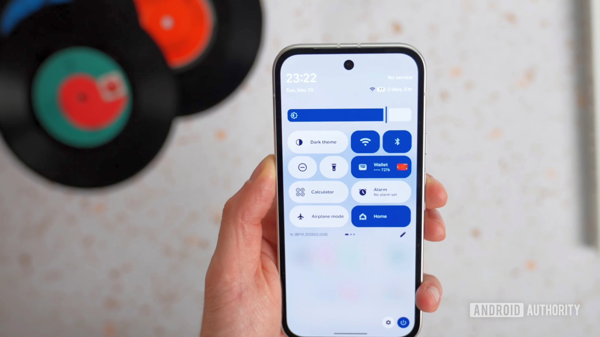
Visual changes, like the volume/brightness sliders and blurred UI elements, make Android 16 QPR1 look fresh and new in a way Android hasn’t in a long time. But more so than the visuals, what’s impressed me the most about Material 3 Expressive is how it feels.
When moving an app icon on your home screen, there are now subtle vibrations as you move it around empty spaces on the page. When you swipe a notification away, it gently pushes on notifications above/below it, before it finally releases with haptic feedback as you swipe it away. If you swipe up on an app in the recent apps page but then let it go, it bounces the surrounding app cards as it falls back into place.
These are all things that are difficult to put into writing, but you notice them the second you start interacting with the Android 16 QPR1 Beta. They make Android feel more alive and responsive than ever before, and I’m loving it.
A new look for notifications
Joe Maring / Android Authority
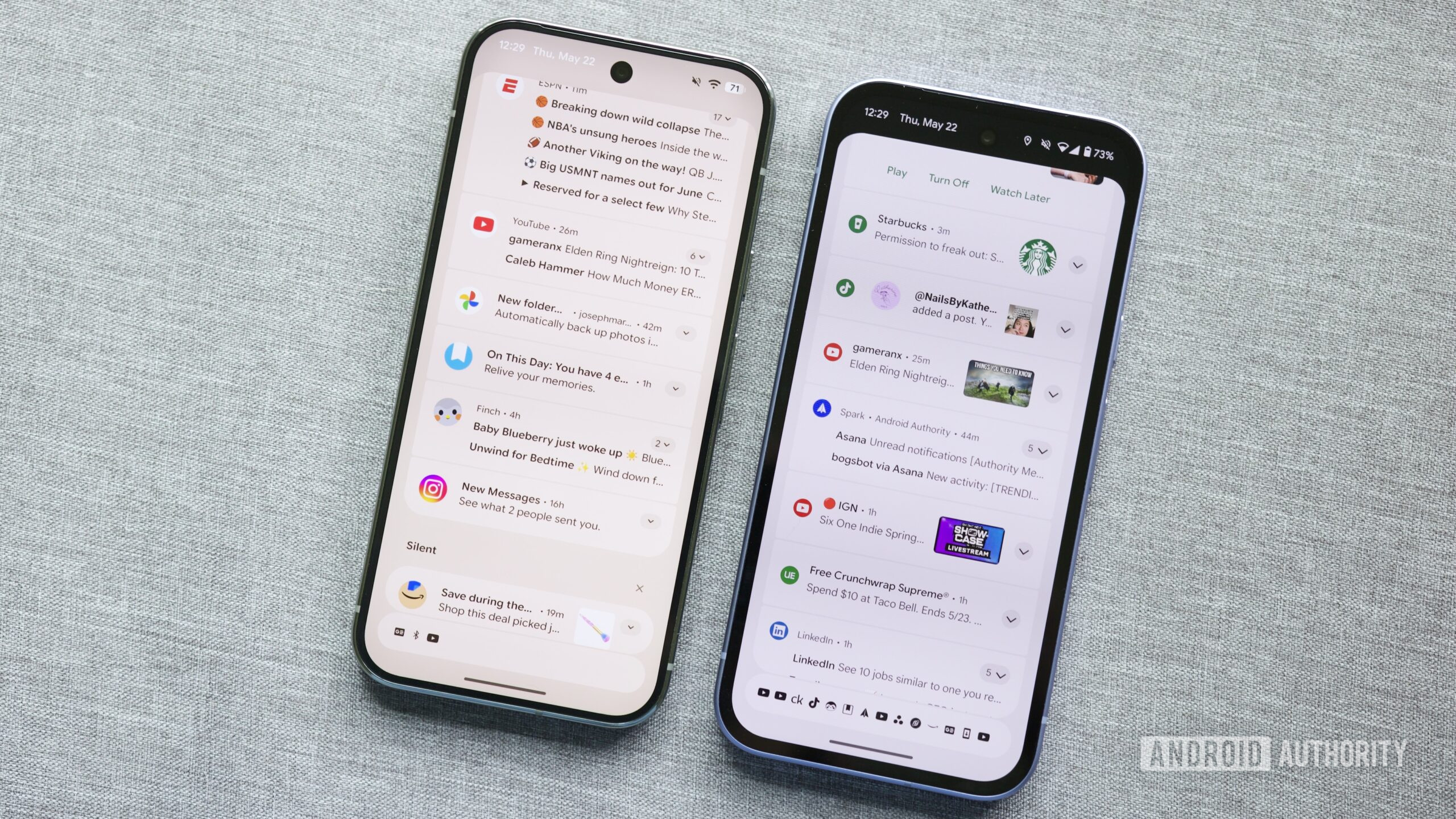
Android 16 QPR1 Beta 1 (left) and Android 15
Speaking of notifications, I love the updated look we have for them in Android 16 QPR1 Beta 1. App icons are larger and more detailed, text is slightly larger and bolder, and notification card colors finally match your system theme.
That may not sound like much on paper, but in practice, it all makes a pretty substantial difference. I find that notifications in Android 16 QPR1 stand out more and are easier to pick up information from while scrolling through them. Maybe it’s a personal preference, but I’m really happy with the changes here.
There’s a much better Settings app
An even bigger visual change that I’ve been thrilled with is the new Settings app. The differences are apparent as soon as you open the app, with color-coded icons used to group settings tabs together. Not only does it make Settings look more lively, but it also works well as a visual indicator of related pages.
Furthermore, other menus within the Settings app look better, too. Different categories of settings are more clearly separated from each other, while buttons are also more clearly defined. The actual layout and options available largely remain the same, but it’s all presented so much better than before.
More customizable quick settings
Joe Maring / Android Authority
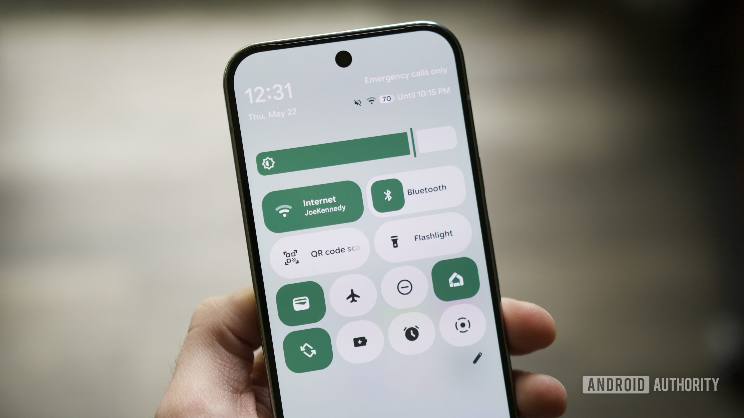
Android 16 QPR1 Beta 1 shows some love to quick settings, too. Specifically, it adds a much-needed customization option. Now, in addition to arranging the position of your quick settings toggles, you can also change their size.
Currently, there are just two size options available: the standard oval shape, plus a new small circle that takes up half the space. I’d love to see even more size options down the road, but already, this has helped make my quick settings feel neater and more efficient. It lets me have all the toggles I want without them taking up an enormous amount of space, and the new shapes add some much-needed visual flair, too.
Magic Portrait is so much fun
Joe Maring / Android Authority
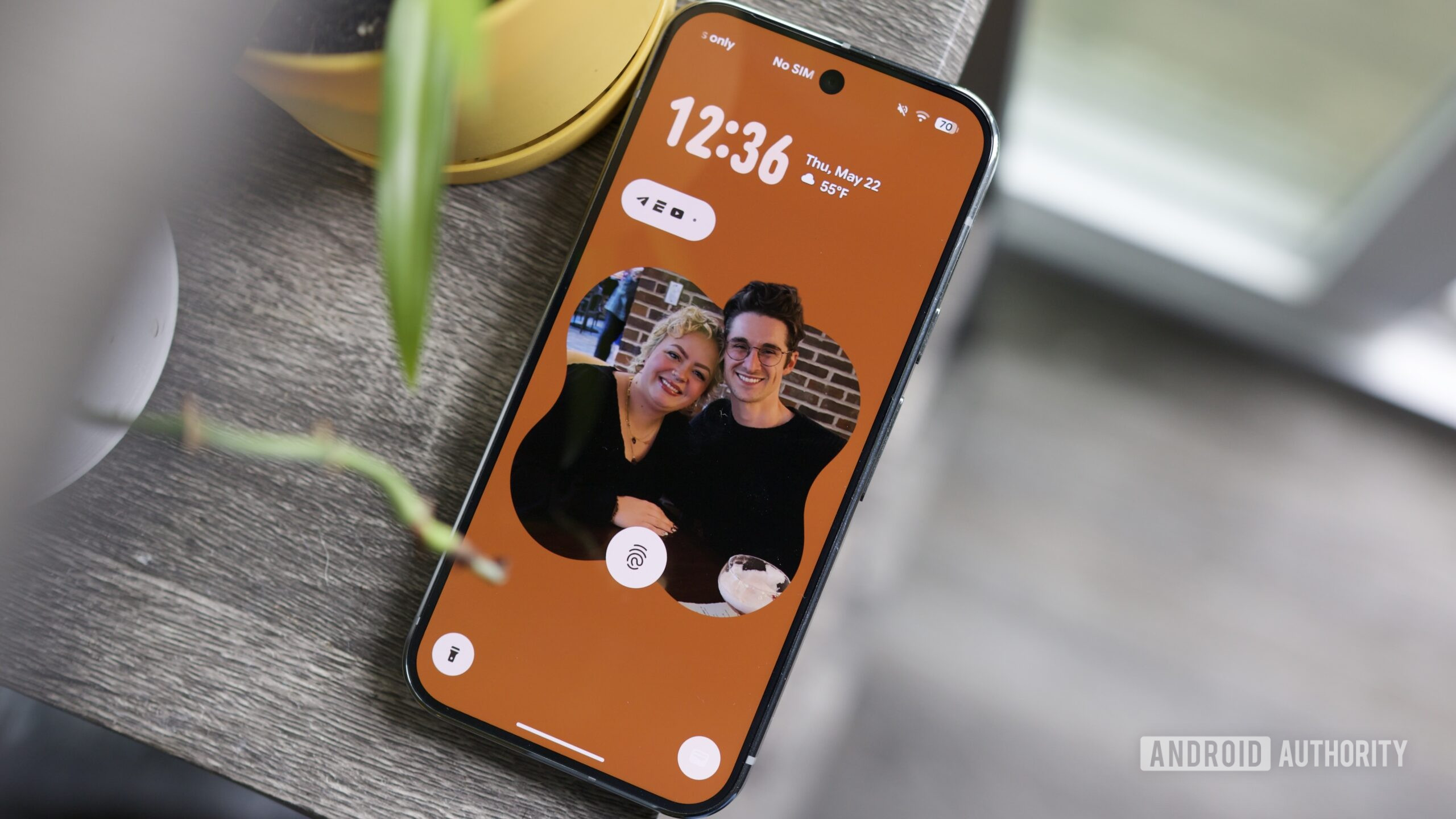
This is a feature I didn’t expect at all going into the Android 16 QPR1 Beta, but it’s quickly become one of my favorites. While adding a new lock screen or home screen wallpaper, you can now tap a new Effects button to spruce it up. This is where you’ll find Magic Portrait, which frames the subject of your wallpaper photo into a fun cutout. You can then customize the shape of the frame, plus the color and saturation of the background surrounding it.
Once it’s all set up, it looks so damn good. Not only does it add a load of style to your lock screen, but when you unlock your phone, there’s a stunning transition effect where your photo bursts out of the frame to take over your home screen. It’s charming to the nth degree, and I’ve been having a blast playing with it. As someone who usually uses Backdrops wallpapers, Magic Portrait may convert me to using my photos. It’s that good.
An updated Wallpaper & style app
On the note of lock screen customization, the “Wallpaper & style” app has a brand new look in the Android 16 QPR1 Beta, and it’s a pretty substantial upgrade.
Now, you can swipe back and forth between your lock screen and home screen options instead of tapping the touch targets near the top of the screen. All of the lock screen clock settings are also grouped together in a new Clock area, whereas they were previously spread out across a couple of different menus. Combined with a general refresh for all menus and UI elements through the Wallpaper & style app, it’s a much better experience than we have in Android 15.
The worst things about Android 16 QPR1 Beta 1
Joe Maring / Android Authority
Overall, my first impressions of Android 16 QPR1 Beta 1 have been really positive. Almost all of the changes are for the better, and they help make Android 16 feel more lively and intuitive than any previous version. That all said, there are a couple of things in the update that I’m not particularly fond of.
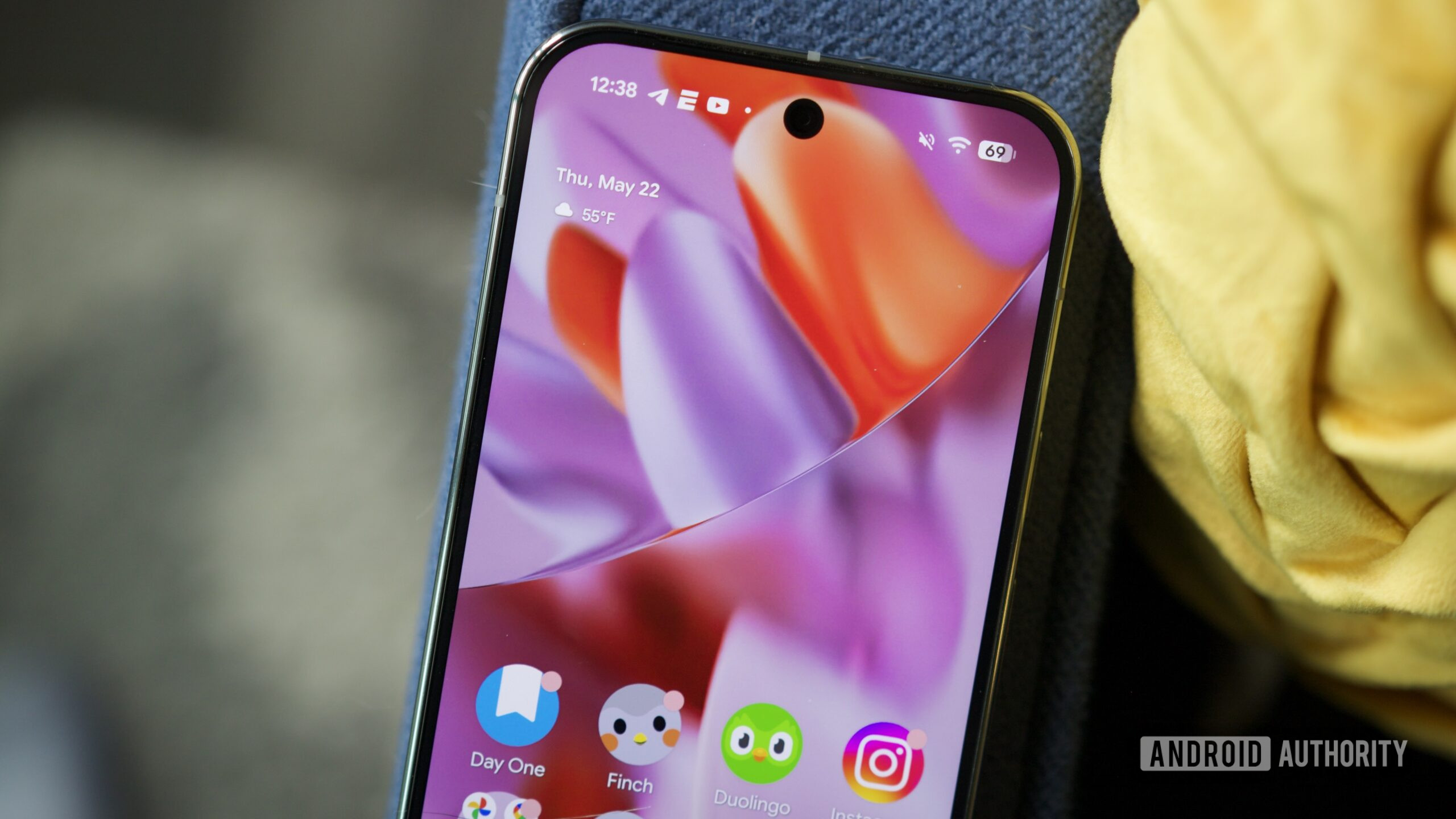
The first is the new battery icon in the status bar. In Android 15, your battery percentage is displayed next to the battery icon, but in Android 16 QPR1 Beta 1, the percentage is placed inside the battery. Is it a bit tidier? Sure. But it also decreases the visibility of the percentage number, making it more difficult to see at a glance. It’s not the end of the world, but I’d like an option to go back to the old design.
I also don’t like what Google did to the At a Glance widget on the home screen. It’s now slightly smaller than before, giving you an extra row of space for apps and widgets. Which is fine, but it doesn’t solve anything.
As someone who’s been begging Google for an option to remove At a Glance from the home screen altogether, making it smaller doesn’t help. And if you like At a Glance, I don’t think you’ll be thrilled with its new size either, as I find it quite challenging to read at times, especially with a busy wallpaper. To me, this feels like a move most folks won’t be happy with. I hope the old size comes back for people who like At a Glance, and for the rest of us, it’s time Google finally gives us the option to get rid of it.
Off to a great start
Mishaal Rahman / Android Authority
While I’d like to see those above complaints addressed in future updates, it’s a testament to how good Android 16 QPR1 Beta 1 is if my two biggest issues are the design of a battery icon and the size of At a Glance.
I think you’ll have a great time with Android 16 QPR1 Beta 1.
Google seems to be nailing almost everything with Android 16 QPR1. The Material 3 Expressive redesign is exciting, the added customization with quick settings is great, and I cannot stress enough how wonderful Magic Portrait is.


