Smashing Animations Part 1: How Classic Cartoons Inspire Modern CSS — Smashing Magazine TechTricks365
TECHTRICKS365
Have you ever thought about how the limitations of early cartoon animations might relate to web design today? From looping backgrounds to minimal frame changes, these retro animation techniques have surprising parallels to modern CSS. In this article, pioneering author and web designer Andy Clarke shows how he applied these principles to Emmy-winning composer Mike Worth’s new website, using CSS to craft engaging and fun animations that bring his world to life.
Browser makers didn’t take long to add the movement capabilities to CSS. The simple :hover pseudo-class came first, and a bit later, the transitions between two states. Then came the ability to change states across a set of @keyframes and, most recently, scroll-driven animations that link keyframes to the scroll position.
Even with these added capabilities, CSS animations have remained relatively rudimentary. They remind me of the Hanna-Barbera animated series I grew up watching on TV.
These animated shorts lacked the budgets given to live-action or animated movies. They were also far lower than those available when William Hanna and Joseph Barbera made Tom and Jerry shorts while working for MGM Cartoons. This meant the animators needed to develop techniques to work around their cost restrictions and the technical limitations of the time.
They used fewer frames per second and far fewer cells. Instead of using a different image for each frame, they repeated each one several times. They reused cells as frequently as possible by zooming and overlaying additional elements to construct a new scene. They kept bodies mainly static and overlayed eyes, mouths, and legs to create the illusion of talking and walking. Instead of reducing the quality of these cartoons, these constraints created a charm often lacking in more recent, bigger-budget, and technically advanced productions.
(Large preview)
The simple and efficient techniques developed by Hanna-Barbera’s animators can be implemented using CSS. Modern layout tools allow web developers to layer elements. Scaleable Vector Graphics (SVG) can contain several frames, and developers needn’t resort to JavaScript; they can use CSS to change an element’s opacity, position, and visibility. But what are some reasons for doing this?
Animations bring static experiences to life. They can improve usability by guiding people’s actions and delighting or surprising them when interacting with a design. When carefully considered, animations can reinforce branding and help tell stories about a brand.
Design by Andy Clarke, Stuff & Nonsense. Mike Worth’s website will launch in June 2025, but you can see examples from this article on CodePen. (Large preview)
Introducing Mike Worth
I’ve recently been working on a new website for Emmy-award-winning game composer Mike Worth. He hired me to create a bold, retro-style design that showcases his work. I used CSS animations throughout to delight and surprise his audience as they move through his website.
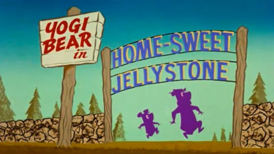
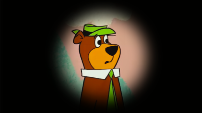
Mike loves ’80s and ’90s animation — especially Disney’s Duck Tales. Unsurprisingly, my taste in cartoons stretches back a little further to the 1960s Hanna-Barbera shows like Dastardly and Muttley in Their Flying Machines, Scooby-Doo, The Perils of Penelope Pitstop, Wacky Races, and, of course, Yogi Bear.
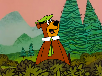
So, to explain how this era of animation relates to CSS, I’ve chosen an episode of The Yogi Bear Show, “Home Sweet Jellystone,” first broadcast in 1961. In this story, Ranger Smith inherits a mansion and (spoiler alert) leaves Jellystone.
The Yogi Bear Show, copyright Warner Bros. Entertainment Inc. (Large preview)
Dissecting Movement
In this episode, Hanna-Barbera’s techniques become apparent as soon as a postman arrives with a telegram for Ranger Smith. The camera pans sideways across a landscape painting by background artist Robert Gentle to create the illusion that the postman is moving.
The Yogi Bear Show, copyright Warner Bros. Entertainment Inc. (Author’s recreation) (Large preview)
The background loops when a scene lasts longer than a single pan of Robert Gentle’s landscape painting, with bushes and trees appearing repeatedly.
The Yogi Bear Show, copyright Warner Bros. Entertainment Inc. (Large preview)
This can be recreated using a single element and an animation that changes the position of its background image:
See the Pen [Yogi Bear background image scroll [forked]](https://codepen.io/smashingmag/pen/NPPzgyq) by Andy Clarke.
See the Pen Yogi Bear background image scroll [forked] by Andy Clarke.
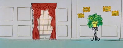
Although beautifully executed, Robert Gentle’s background paintings were often remarkably simple. The mansion’s interior background rushes past to create the illusion of Ranger Smith dashing across it, so it needed very few details.
The Yogi Bear Show, copyright Warner Bros. Entertainment Inc. (Large preview)
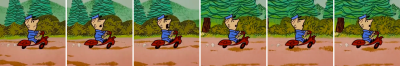
The economy of movement was essential for producing these animated shorts cheaply and efficiently. The postman’s motorcycle bounces, and only his head position and facial expressions change, which adds a subtle hint of realism.
The Yogi Bear Show, copyright Warner Bros. Entertainment Inc. Sequence shortened. (Large preview)
Likewise, only Ranger Smith’s facial expression and leg positions change throughout his walk cycle as he dashes through his mansion. The rest of his body stays static.
The Yogi Bear Show, copyright Warner Bros. Entertainment Inc. Sequence shortened. (Large preview)
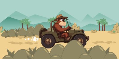
In a discarded scene from my design for his website, the orangutan adventurer mascot I created for Mike Worth can be seen driving across the landscape.
Mike Worth’s website will launch in June 2025, but you can see examples from this article on CodePen. (Large preview)
I drew directly from Hanna-Barbera’s bouncing and scrolling technique for this scene by using two keyframe animations: background-scroll and bumpy-ride. The infinitely scrolling background works just like before:
See the Pen [Mike Worth background image scroll [forked]](https://codepen.io/smashingmag/pen/ByyVZrB) by Andy Clarke.
See the Pen Mike Worth background image scroll [forked] by Andy Clarke.
As Michelle Barker wrote about here at Smashing Magazine back in 2021:
“When working with motion on the web, it’s important to consider that not everyone experiences it the same way. What might feel smooth and slick to some might be annoying or distracting to others — or worse, induce feelings of sickness or even cause seizures.”
— Michelle Barker
You can prevent that from happening by turning off animations when someone has chosen reduced motion in their browser by using the prefers-reduced-motion media query:
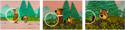
Since each episode’s budget and production time were limited, William Hanna and Joseph Barbera created a streamlined process for producing their animations. They used as few as 2,000 individual drawings and just a few background paintings per episode, often reusing them on several episodes.
The Yogi Bear Show, copyright Warner Bros. Entertainment Inc. (Large preview)
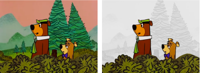
Watch the episode and you’ll see these trees appear over and over again throughout “Home Sweet Jellystone.” Behind Yogi and Boo-Boo on the track, in the bushes, and scaled up in this close-up of Boo-Boo:
The Yogi Bear Show, copyright Warner Bros. Entertainment Inc. (Large preview)
The animators also frequently layered foreground elements onto these background paintings to create a variety of new scenes:
On the left: The Yogi Bear Show, copyright Warner Bros. Entertainment Inc. On the right: Author’s edit.(Large preview)
In my deleted scene from Mike Worth’s website, I introduced these rocks into the foreground to add depth to the animation:
Mike Worth’s website will launch in June 2025, but you can see examples from this article on CodePen. (Large preview)
If I were using bitmap images, this would require just one additional image:
See the Pen [Mike Worth layered animation [forked]](https://codepen.io/smashingmag/pen/xbbzraj) by Andy Clarke.
See the Pen Mike Worth layered animation [forked] by Andy Clarke.
Had I continued developing this scene, I might’ve added a slower scrolling animation to those rocks to introduce a parallax effect for even greater realism.
Looping Frames Create Movement
To meet their limited budget and production schedules, Hanna Barbera’s animators carefully planned their animations and cleverly only animated specific elements. While heads and facial expressions make characters talk and their legs change to make them walk, most characters’ bodies remain relatively static. So, throughout this entire scene of Ranger Smith walking and talking his way across his cabin, only his face and legs are animated:
The Yogi Bear Show, copyright Warner Bros. Entertainment Inc. (Large preview)
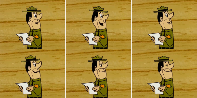
Likewise, when the ranger reads his telegram, only his eyes and mouth move:
The Yogi Bear Show, copyright Warner Bros. Entertainment Inc. (Large preview)
If you’ve wondered why both Ranger Smith and Yogi Bear wear collars and neckties, it’s so the line between their animated heads and faces and static bodies is obscured:
The Yogi Bear Show, copyright Warner Bros. Entertainment Inc. Author’s recreation. (Large preview)
I replicated how Hanna-Barbera made Ranger Smith and other characters’ mouths move by first including a group that contains the ranger’s body and head, which remain static throughout. Then, I added six more groups, each containing one frame of his mouth moving:
I used CSS custom properties to define the speed at which characters’ mouths move and how many frames are in the animation:
See the Pen [Ranger Smith talking [forked]](https://codepen.io/smashingmag/pen/QwwxgJE) by Andy Clarke.
See the Pen Ranger Smith talking [forked] by Andy Clarke.
Working With Mike Worth
When Mike Worth and I sat down to discuss working together, we both understood that there would be neither the budget nor the time to create a short animated cartoon for his website. We also knew that video would be the correct format for a fully animated production, but we were keen to explore how CSS could bring what would’ve otherwise been static images to life. So, this begs the question of why and when to use CSS animations.
Ambient Animations
Subtle ambient animations contribute to a website’s atmosphere and help with storytelling without distracting from its content or functionality.
For Mike Worth’s about-page illustration, I shone shafts of light onto a stone tablet to add depth to an otherwise flat image. Inside my SVG, I added a path for the light and reduced its opacity to .25:
I then defined an SVG filter to blur the edges of my light shafts and linked it to my path:
Finally, I added a subtle ambient animation that rotates the light shafts and creates a more natural feel:
See the Pen [Mike Worth’s about page animation [forked]](https://codepen.io/smashingmag/pen/bNNKROE) by Andy Clarke.
See the Pen Mike Worth’s about page animation [forked] by Andy Clarke.
Can you throw more light on Mike’s navigation?
See the Pen [Light up Mike Worth about page [forked]](https://codepen.io/smashingmag/pen/ZYYRyVJ) by Andy Clarke.
See the Pen Light up Mike Worth about page [forked] by Andy Clarke.
Animations On Interactions
In the same way that a :hover pseudo-class provides valuable visual feedback when someone interacts with an element, CSS animations can create a deeper connection between people and a design.
I included an Easter egg interaction on Mike Worth’s review page illustration. The big red button turns the desk lamp on and off, much to the consternation of Mike’s orangutan mascot, who’s trying to study his map. To implement this, I applied a data- attribute to the SVG illustration:
And added a red button for any curious visitor to press:
When someone presses that red button, the light goes out, which is made possible by changing the value of the SVG’s data- attribute from lights-on to lights-off.
Several elements within the illustration light up when the desk lamp is on. To make this happen, I applied a class value to those specific items:
And used the data-attribute value to toggle the glow on and off when someone presses the lamp’s button:
Animations can also tempt people to venture deeper into a design, so I made the crystal skull on the desk vibrate to hint at something more to discover:
See the Pen [Mike Worth’s review page animation [forked]](https://codepen.io/smashingmag/pen/YPPvQBg) by Andy Clarke.
See the Pen Mike Worth’s review page animation [forked] by Andy Clarke.
Animations Tell Stories
When carefully considered, animations can reflect a brand’s identity and help tell its story.
Mike Worth’s brand is high-energy — just like his personality — and the story he tells about his work as a video game composer is engaging and playful. Mike wanted every interaction with his website to bring his personality to the screen.
Should someone get lost along their journey, they’ll end up on Mike’s 404 page, where his hero has a sinking feeling. While Mike’s orangutan adventurer slips deeper and deeper into the quicksand, animated bubbles rise:
See the Pen [Mike Worth’s 404 page animation [forked]](https://codepen.io/smashingmag/pen/ZYYRyPX) by Andy Clarke.
See the Pen Mike Worth’s 404 page animation [forked] by Andy Clarke.
Bringing It All To Life
Just as the animators at Hanna-Barbera turned technical limitations into their signature style, CSS animations enable web professionals to craft characterful experiences. By layering elements, looping frames, and applying subtle movement, you can inject personality into a design while improving someone’s experience.
The Yogi Bear Show, copyright Warner Bros. Entertainment Inc. (Large preview)
In my design for Mike Worth’s website, animation isn’t just for decoration; it tells a compelling story about him and his work. Every movement reflects his brand identity and makes his website an extension of his creative world.


