It’s true that the Liquid Glass redesign is less than revolutionary, but at least with macOS 26, with it, Apple is making users be more productive.
Maybe it’s just because it is ridiculous how quickly you get used to a new macOS. But a couple of days after Apple made it sound incredibly new and different, macOS Tahoe visual differences seem small, yet still useful.
Just as with iOS 26, it’s possible to say that the Liquid Glass redesign is putting a new surface on the Mac without fundamentally changing anything. Yet the visual design is deeply part of what productivity benefits have come with macOS Tahoe.
For instance, Apple has had practically 30 years to introduce a clipboard manager, but instead left that to third-party apps because it was also leaving it to power users. Apple always focuses on the casual or light users that make up most of its customers, but now it believes it’s time to give those the ability to paste from their clipboard history.
And it’s done so by taking the familiar Spotlight and breaking it out visually. As long as you know to press Command-Space to call up Spotlight, you now immediately see the new option.
Really what you see is that there are options, and while they are right there in your face, they are also not in the way. A Liquid Glass look, together with well-chosen separation of Spotlight tools, means that it’s easier for users to find this feature.
Then when you are using features where it may not be so obvious where you find a control, Liquid Glass has made it more obvious. In any media player, for instance, the previously small position icon in the slider has been replaced by a much more prominent, elongated one that’s hard to miss.
Content comes first
It’s a funny thing, but all of the new and flashy glossiness of the Mac’s controls is intended to help hide those same controls. Apple wants our content, the work we’re doing, and the media we’re using to be the most prominent thing.
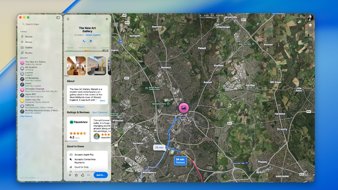
That’s immediately apparent if you try to find a route to somewhere in Apple Maps. It used to be that you would enter one place in the search box at top left, then click on the found place in the map itself.
Then there would be a pop up that you had to fill in with the starting place, or the end if you were planning a route from here. It was fine, but it was a bit clunky and easy to dismiss the route-finding dialog.

Apple Maps now keeps its direction-searching element out of the way of the map itself
Now you type into the search bar in the lefthand column as before, but when you do, an equal-sized column appears to spring out of it. You go back and forth between these two columns and it just feels like a more natural, even professional way to do what you need.
Seeing clearly
The best and most extreme example of making content take priority this is just how transparent — or really the word is translucent — the Mac’s on-screen furniture can now be. The menu bar is invisible by default, which Apple says means you see more of your work.
The Dock has at least elements of this glassy invisibility, but it can also be pretty much entirely turned off. The Dock can be set so that all of its app icons are glass.

You don’t have to have a transparent Dock (top) but now you canYou don’t have to have a transparent Dock (top) but now you can
So with a glass Dock, an invisible menu bar, and also widgets that display as transparent glass, the Mac’s screen can appear to be all our content.
At the moment, with the very first developer beta, the effect is spoiled by how some apps don’t play nice. Their full-color icons shine out of the glass Dock like a grinning mouth with a single tooth.
But those apps will come around once developers have had more than 20 minutes to work on their apps. So it will get better, it will get that the illusion of our work filling the entire screen, is improved.

The Mac menubar is now invisible and you can’t change that.
It’s a laudable aim and, since you don’t have to go so far as to have everything invisible, it’s a little customizable.
Readability
The one area where all of this transparency or translucency falters, though, is in readability. If you can’t read what you need or you can’t find the app you want, Liquid Glass would be sap productivity.
And it’s possible to get into just that situation. Since menus and dialog boxes now let you see more of the background through them, there are combinations of colors that do not work.
That shouldn’t be the case, because the color effect on any Mac menu or dialog is supposed to be calculated to be clear against whatever the background is. Maybe this is something that will develop and evolve as Apple goes through the beta process.
It’s hard to see how the Dock would change, though. And at present if you do have it set to show glassy icons, it takes a lot of getting used to.
Some new Dock icons are slightly inset — while others are not yet transparent.
That’s because as well as having all colors changed to various degrees of transparency, the app icons are slightly inset into a square-ish frame. It means that the app icons are fractionally smaller, even though they are taking up the same space in the dock.
Consequently you lose being able to spot the colors, and you lose being able to spot the icon shape quite so readily. You do still have muscle memory of where the app is in your Dock, though.
Form follows function
There’s nothing wrong with macOS being scrubbed up visually, and it does contribute to a sense that you have a new Mac. But the visuals have to perform a function, they have to provide a benefit.
Much of what macOS Tahoe does is around this business of keeping your focus on your work. But there are also smaller touches that aren’t flashy, but are part of the design — and simply make sense.
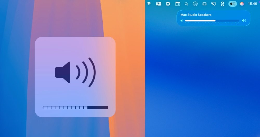
As of macOS Tahoe, if you change the volume on your Mac, the visual confirmation comes with a small, wide icon showing a slider. That icon, though, is positioned up toward the top right of the screen instead of being the large graphic toward the lower middle of the display.

The old volume indicator (right) and the newThe old volume indicator (right) and the newThe old volume indicator (right) and the newThe old volume indicator (right) and the new
That’s immediately better if you’ve ever had to restart a screen recording because you leant on the volume button. But it’s also better because it means information is being displayed right where all Mac notifications go.
Especially for new users, it is reinforcing where to look to find out what you need.
Although, curiously, Apple has also moved something in practically the opposite way.
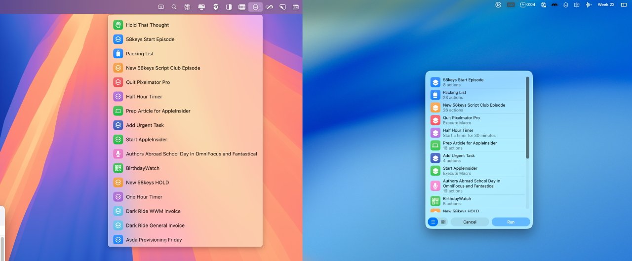
In macOS Sequoia, if you have Shortcuts in your menubar, clicking on its icon gives you a dropdown menu. Whereas, in macOS Tahoe, it instead presents a dialog box roughly in the center of your display.

Shortcuts in the menu bar used to be a dropdown menu (left)
The new macOS Tahoe way does have a benefit that as well as the Shortcut titles that were always displayed, it now includes a little extra detail about each one. They’re just not terribly useful details — most of the time it says how many actions or steps there are in the Shortcut.
There’s also an inconsistency here. In this example, it’s possible to use the keyboard to hit Return on a Shortcut and so run it. But in similar dialogs you create with Shortcuts, you have to use a mouse or trackpad.
Small changes can mean a lot
It was overblown of Apple to make this sound like a transformation of the Mac. But it did look like one when they showed it, and it did still look like a bit of one when you first start using the betas.
You do still, though, get used to all that’s new. You get used to it pretty much immediately.
And if examining Liquid Glass in detail means thinking less and less of its scope and innovation, there is still this. Spend an hour on macOS Tahoe and last year’s macOS Sequoia looks and feels so old.


