Andy Walker / Android Authority
I’ve had a blast using One UI 7 on my Galaxy phone. Now Bar has changed the way I juggle through playlists and monitor dishes in the oven, while its expanded Routines actions offers even more inventive ways of using its built-in automation feature. But one thing I’ve largely avoided until now was One UI Home. I’ve never been partial to stock launchers, but since I gave Pixel Launcher a fair chance and built a fairly productivity-minded home screen with it, it’s only right that I give One UI Home its spotlight.
I decided to use One UI Home as my primary launcher for a week, leaving behind the comfort of Kvaesitso for the wild west of Home Up and widget stacks. I soon learned that these features helped me build a sensible, efficient home screen environment.
Which do you prefer: One UI Home or a third-party launcher?
2 votes
Turning my insane Samsung home screen into something sensible

Andy Walker / Android Authority
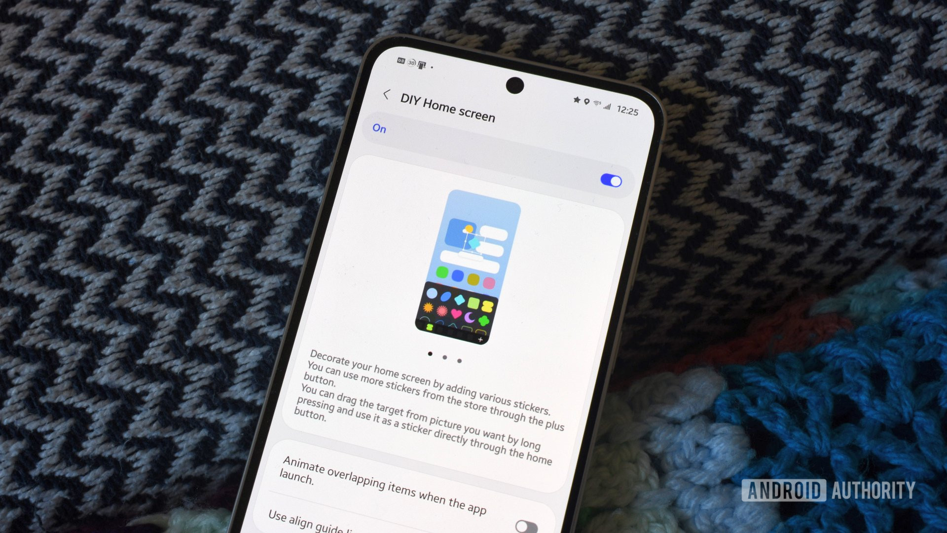
With the rollout of One UI 7, One UI Home has seen welcome changes. Finally, I have access to a vertically scrolling app list, which makes all the difference for someone like me. I’ve also embraced Home Up, a Good Lock module that removes more boundaries for those who love an everything-everywhere-all-at-once home screen experience. Unlike my colleague Ryan Haines, who experimented with this feature’s choice elements, I wanted to use it to bring more order to my home screen.
So, how did I accomplish this? Or at least, how did I plan to achieve this? Unlike my Pixel Launcher experiment, which sought to simplify the first screen I see on my phone to reduce distractions, my One UI Home main screen crams as much information as possible. I wanted to minimize procrastination by hiding social apps from the home screen and reducing my desire to constantly tinker. As a result, I limited myself to important widgets only, while frequently accessed apps are set in folders on the home screen.
This setup is widget-heavy, but the use of stacks brings thoughtful order to the madness.
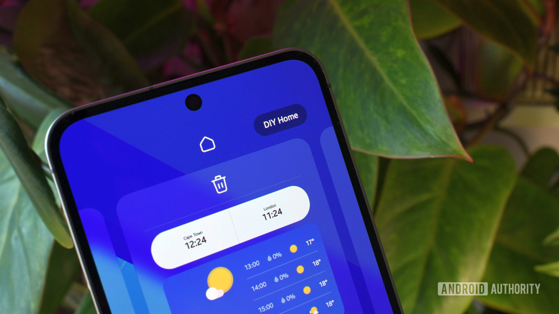
I also ensured I maximized the gaps between various elements, giving each widget as much room as possible. This was somewhat possible through Home Up’s DIY Home feature. Beware, it’s in beta, so be prepared to encounter bugs. I sure did. I’ll mention my issues later. Nevertheless, I continued to embrace One UI Home’s features, particularly widget stacking. I used this feature to make the most of the available space without cluttering my view.
Finally, as I only included important apps on the home screen, every other app can be found using a swipe down and a search via Samsung Finder. It’s how I use almost every other launcher, so it’s a familiar and efficient workflow.
What my DIY home screen looks like, and why it works for me
Now, let’s get into the actual setup. First, I keep Google Discover enabled. As I also use a Pixel 8, swiping right to access cherry-picked articles has become muscle memory for me.
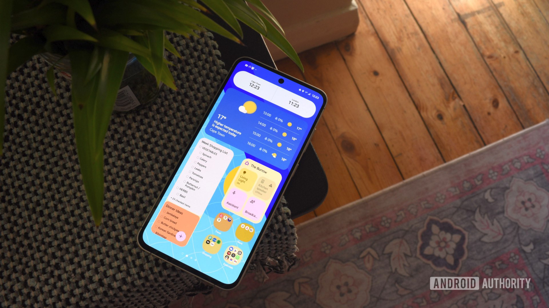
Beyond this, I use two screens for my home setup. The first, which I’ll call the main screen, consists almost entirely of widgets. The topmost widget is Samsung’s default clock, which displays my local and New York time. This is essential since most of our team uses East Coast time to sync, and I constantly forget the time difference between South Africa and New York.
Below this widget, you’ll find my first widget stack focusing on weather conditions. The top widget is Samsung’s default, offering the current temperature and conditions, and the forecast for the next three hours. This is particularly important during winter in Cape Town. Fronts come and go, and so does the rain, so being aware of how long it’ll pour or drizzle ensures I don’t get caught in it. Swipe again, and you’ll find my favorite radar widget, Weather & Radar. I love this app and use it through Android Auto while driving, too. Naturally, it deserves a place here. Finally, I included a Windy widget to detail the wind gusts in my area, something the other two widgets don’t display adequately. Of course, Breezy Weather’s Material widget is still king if you don’t like these widgets and want a more Google-ified widget.

Andy Walker / Android Authority
Below this stack, I use two banks of widget stacks side by side. On the right, the Google Home widget gives me quick access to our kitchen Nest Mini and our generic ambient smart light behind the TV. The other widget in the stack is Samsung’s battery widget, providing a detailed look at my phone and watch battery. My Galaxy Buds also appear when I’m using them, making it a nifty on-the-go way to check if anything needs a charge.
On the left, I have a narrow stack that includes Google Keep, Google Calendar’s agenda, and Tasks.org’s widget. The latter is far superior to Google’s own iteration, and I believe it’s worth switching into your rotation. I think Keep and the agenda widgets speak for themselves — I like having quick access to my grocery list, dinner ideas board, and my random, daily to-dos.
Finally, I have four folders of frequently used apps in the bottom right corner, closest to my right thumb, split by use case. Travel includes apps like Google Maps and Fuelio, Work includes Notion, Shopping is self-explanatory, and Essentials hosts everything else, including Firefox, Gmail, Material Files, the Play Store, and Google Wallet.

Andy Walker / Android Authority
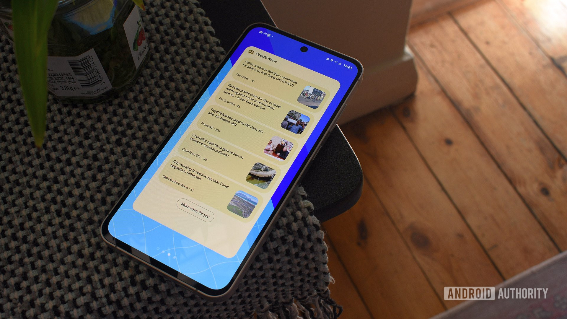
The second screen consists solely of one launcher stack, with Google News, Sofascore, and Investing widgets residing here. Discover doesn’t do a great job of highlighting local news, but News does. Sofascore is essential for a soccer fan, while Investing is key for keeping up with commodity prices and exchange rates.
I’ve been happy with this setup for over a week, but I feel there’s room for improvement. At some point, a third screen housing a more detailed weather widget like Meteogram may be in the offing. A review of the apps on the main screen is also in order.
One UI’s customization tools give me plenty, but it’s still not enough

Andy Walker / Android Authority
While this One UI 7 Home setup could be mirrored in almost every other launcher, two things made it easier to achieve here: DIY Home Screen and widget stacking.
The latter is essential for keeping my home screen tidy, functional, and clutter-free without forcing me to drop useful widgets from my rotation. A dedicated weather stack is so useful, while having quick access to Keep and Calendar in one sliver of the home screen is brilliant.
Home Up is also vital for maximizing space between widgets, even though it’s the most frustrating feature I’ve ever used in a launcher. Yes, I know it’s in beta, so I can’t really complain, its tendency to randomly snap objects onto invisible grids and rotating elements had me pull my hair out. Ironically, it forced me to be more conservative with placing items on my screen than its purpose would suggest. It’s brilliant for randomly scattered items, but its fine resizing controls still need work.
Home Up is also vital for maximizing space between widgets, even though it’s the most frustrating feature I’ve ever used in a launcher.
After my experiment, I’m debating returning to my original comfy setup. I’ve used Kvaesitso on my Galaxy S24 FE since I got the phone, and it wasn’t easy to let go of it. I can access all my important widgets without them directly encroaching on my home screen or curated wallpaper. I’ve grown used to its gesture controls and search peculiarities. After a few days with One UI Home, I was already missing it.
Nevertheless, I’ve discovered plenty about One UI 7 and Samsung’s customization drive. While features like Home Up’s DIY Home appear to be for those creative folks who plaster their screens with various icons and drawings, it can be used by those seeking order, too. I hope that Samsung considers honing this feature, particularly for those who want to use every inch of our screens.


