
Of all the very many new features in iPadOS 26, none of them make the iPad feel so different as the very many window options. Here’s what we’ve gained — and what we’ve lost.
If it seems ridiculous to be excited about app and document windows on an iPad, it now seems a little bit foolish to have been happy with what we had before. The new paradigm is so good that it feels as if this is the way we should always have worked on the device.
The new features are in iPadOS 26, which at present is only available in a beta test version intended for developers. There will be a public release in the next few weeks, but the safest thing is to wait for the official launch in September.
And then grab iPadOS 26, if only for the new window systems.
What we’ve lost and almost lost
There is one old feature that has been axed, and that’s Slide Over. This was the feature were you could elect to have a iPhone-like apps open in a window that you could swipe from the side of the screen to slide over whatever you were working on.
That’s now completely gone. At first it also appears as if Stage Manager has vanished, but it’s more that it’s been banished to a Settings option.
Stage Manager is now a couple of years old, and it’s a system of grouping apps or documents together. You can tap to jump between sets of apps and, if it were a little fiddly to set up and run, it was Apple’s attempt to help with multitasking.
Now that there is a new system, Stage Manager is really only needed by people who liked it. For them, they can go to Settings, Multitasking & Gestures, and tap to turn it on.
For everyone else, Apple has made it so that you just never discover it by accident, or without a deliberate hunt through Settings. The previous Control Center option is gone, both from being on by default, and even from the extensive list of control options.
So if you like Stage Manager, it’s good that it’s still present. But it’s bad that you can no longer just turn it on or off with a Control Center button.
Nonetheless, if Apple is trying to push you toward using the new windowing systems instead, well, Apple knows best. And in this case, that might not be as entirely sarcastic as it sounds — because the new windows are very good.
How to start using the new windows on iPad
The new system is on by default, so you don’t have to do anything except learn how to take advantage of its options. But that same Settings pane that includes Stage Manager, also contains options for Full-Screen Apps and Windowed Apps.
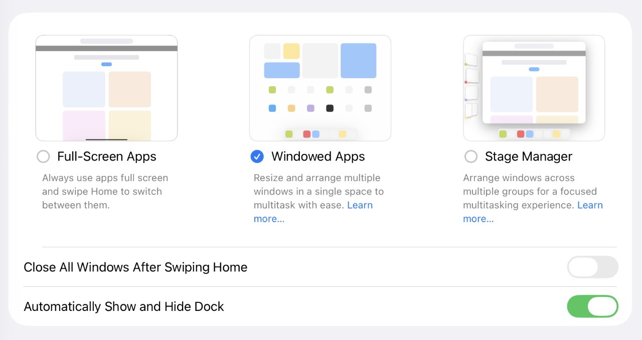
By default, you get the new Windowed Apps option selected, but you change to the old-style Full Screen system
Arguably, these are less about turning on those options, and more about turning off Stage Manager. But if you choose full screen, you don’t get the ability to move and resize windows later.
Plus if you choose Windowed Apps, you no longer have the option to swipe from the bottom left corner to take a screenshot. Or to swipe from the bottom right to start a new Quick Note.
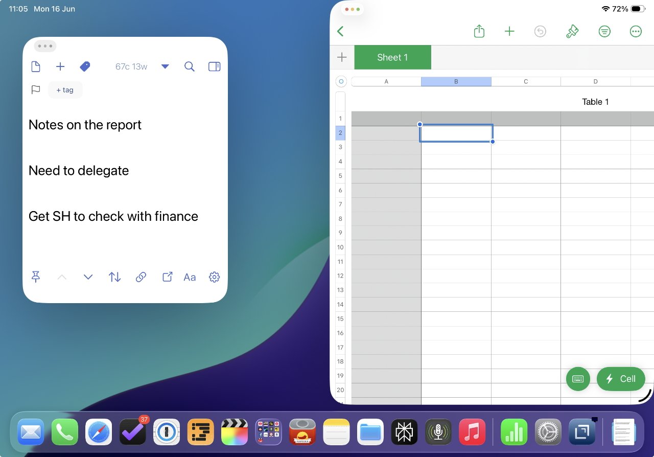
Otherwise, Full-Screen Apps means any time you launch an app, it takes over the whole display — which is exactly what iPad apps have been doing since the device was launched. With Windowed Apps, the app opens in the center of the screen with a wide border around it, showing the desktop and the dock.
The purpose is really to emphasize that you can use more than one app, more than one window. And the way you do that starts with just opening any other app.

The new grab handle that, by default, is at bottom right of every window
Then it’s a matter of moving and resizing windows, which is probably the thing you will do most. To resize a window, you press and hold on the new grab handle at bottom right, and then just drag until the app is the size you want.
There are limits, there is only so narrow or shortened an app can be, for instance, and it does vary depending on the app.
But one you’ve used the grab handle to make an app be anything less than full screen, you can also press and hold on the top title bar of the window to drag it around and reposition it. You do have to be careful not to touch any of the controls that have appeared there, and this gets harder the narrower the window is.
Depending on where you’ve put the window, it can also be that other elements of the iPad get in the way when you want to drag it to a new position. If the window is now toward the very top of the screen, then tapping on it and starting to drag can call up the app’s menubar instead.
Or if the app is toward the top right of the screen, it’s very easy to inadvertently select Control Center.
It’s easy to select Control Center or an app’s menu bar when you’re trying to drag from too near the top of the screen
But you do get used to these gestures, and there are three more new ones that may help. With your finger or an Apple Pencil, you can tap and hold on the title bar of a window, and flick it up.
If you flick it straight up, the app turns to full screen. Flick it to the top right corner instead, and it automatically resizes to take up the whole right half of the display.
Numbers (left) automatically took up the right side of the screen because its window was flicked up and to the right
Similarly, flicking to the top left makes the app take up the whole left side of the screen.
This is one of those gestures that takes time to get right. In AppleInsider testing, for instance, it became easier to flick using different hands. To flick to the right, it seemed to be better to be using the right hand, and the opposite with flicking left.
If you flick anywhere, you can tap on the top of the window and drag it down to have it automatically turn to the size you had it before. It does not then automatically move back to the position you had it before the flick, though.
Window position controls
There is a way to move app windows around without either flicking or dragging, and it’s a way that gets you precise but limited options.
Tap on the three traffic light icons that are now at the top left of every window. That makes them pop out to a larger size so that you can more readily select one.
Mac-like traffic light icons on the iPad
Just tapping on the green one will immediately expand the app to take up the full screen. But if you press and hold on green, you instead get a Mac-like series of eight options in a pop-up menu:
- Move to left side
- Move to right side
- Move to top half
- Move to bottom half
- Make full screen
- Arrange two open apps to take half the screen each
- Arrange all open apps to take up a third of the screen each
- Move apps to each of the four corners
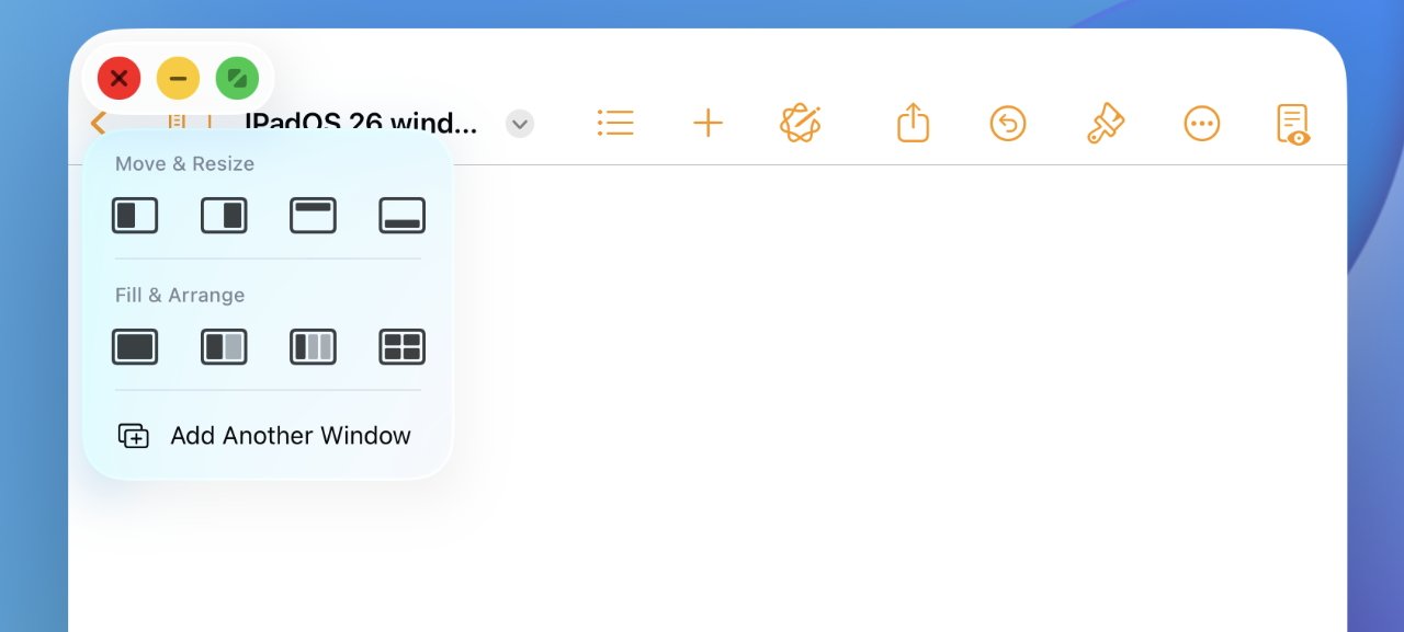
Tap and hold on the green traffic light icon to get Mac-like options for automatically moving and resizing
That last is the least effective because, at least on an 11-inch iPad, the result is that the top two app windows hang over the bottom two. It means you have to tap on an app at the bottom to bring it forward, before you can use the app, or drag, or resize it.
Wither Split View
While Slide Over is gone and Stage Manager is hidden, the old Split View is somewhere in between. It still exists, but it’s less useful than before.
It used to be that if you had two apps open and taking half of the screen each, you automatically got a small vertical bar in between them. Tapping and holding that bar meant you could slide it left and right to increase the size of one app window, while decreasing the other.
This was also a way to get out of Split View because you could drag the slide all the way to the left or right to stop splitting the screen.
Now if you have any two apps side by side, regardless of whether they are taking up the full height of the screen, you get the Split View slider. You can use it just the same for resizing, but it can’t close an app.
Split View’s vertical drag bar between apps still exists, but its use is more limited
Also , when you three or even four apps side by side, you get this slider in between them, but it may have no room to be moved. If you’ve used the iPadOS 26 windowing option to arrange three apps across the screen, for instance, the slider is pointless because all three apps are as narrow as they can get.
One more benefit
Whichever way you use to position and resize your app windows, or actually even if you don’t do any of that and instead keep to full-screen apps, there is one more big advantage to the new system.
It’s to do with opening a second or subsequent document in the same app. This was possible before but required some contortion and it was inconceivable that you’d find the way by accident.
Now you just find the app icon. That could be by just swiping up from the bottom to get the Dock, which is what you have to do if your app is full screen. Or it can mean tapping on a blank spot in the desktop, which then makes all open app windows swoop out of the way.
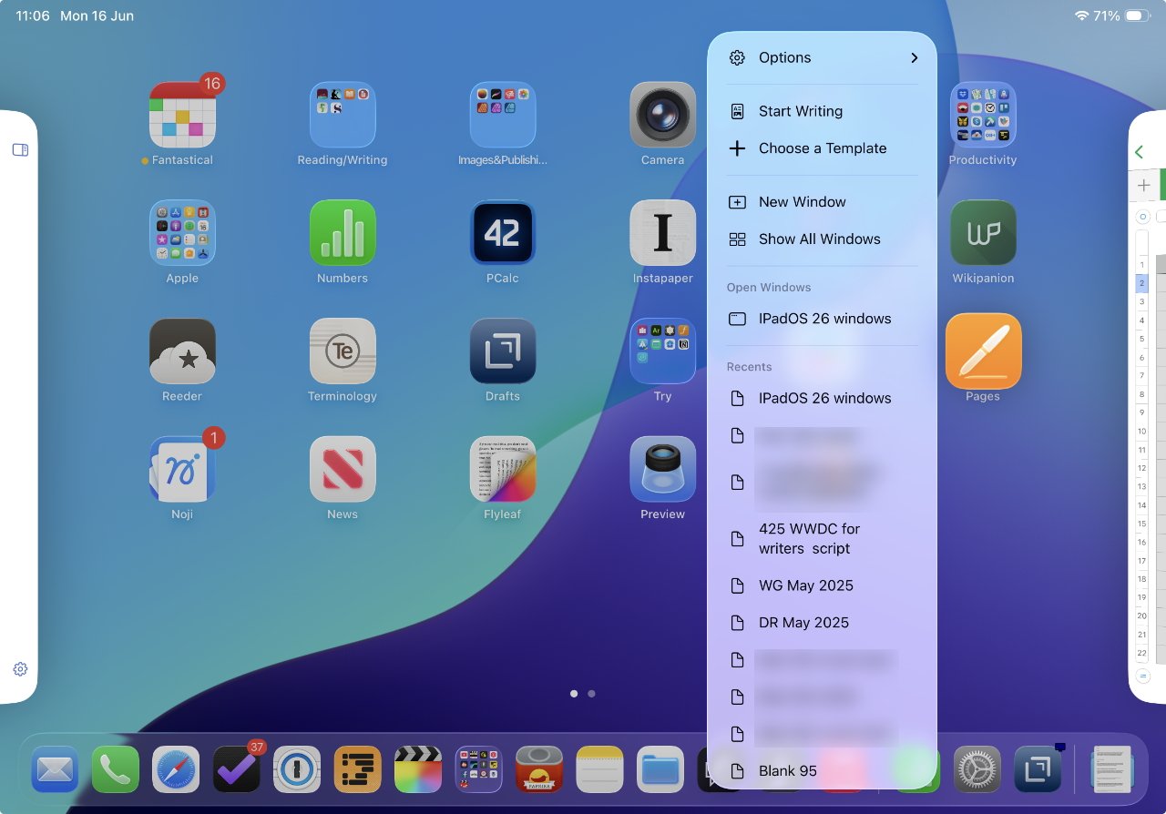
Pressing and holding on an app’s icon now gets you this extremely useful popup menu
Once you can see an app’s icon, you can now press and hold on it to get a new pop up menu. That menu includes either New Document or New Window — or depending on the developer, both.
This is slightly inconsistent at the moment as you’d expect New Window would give you a second view of the same document you’ve already got open. Instead, it gives you the option to open a different document.
So it takes some getting used to, as does most of the new windowing system. But overall, everything works the way you might expect it to as an iPad user — but better.
For all that Apple launched at WWDC 2025, nothing was more radical than this change to the windowing system on iPad. Probably nothing was as big a surprise, either.
And certainly nothing or little else is so immediately useful.