Robert Triggs / Android Authority
Forget summer already; it’s software season, and it’s positively raining betas. Between Android 16 and the new iOS 26, I’ve been knee-deep in mobile OSs and, well… I have notes.
If you’re a regular reader, you might know that I’m not a huge fan of Google’s new Material 3 Expressive. I don’t hate it, but certainly don’t love its paranoia of anything approaching a right-angle. But compared to what Apple’s been cooking up in iOS 26, Material 3 Expressive looks like the modern-day Creation of Adam.
Which UI design is best?
531 votes
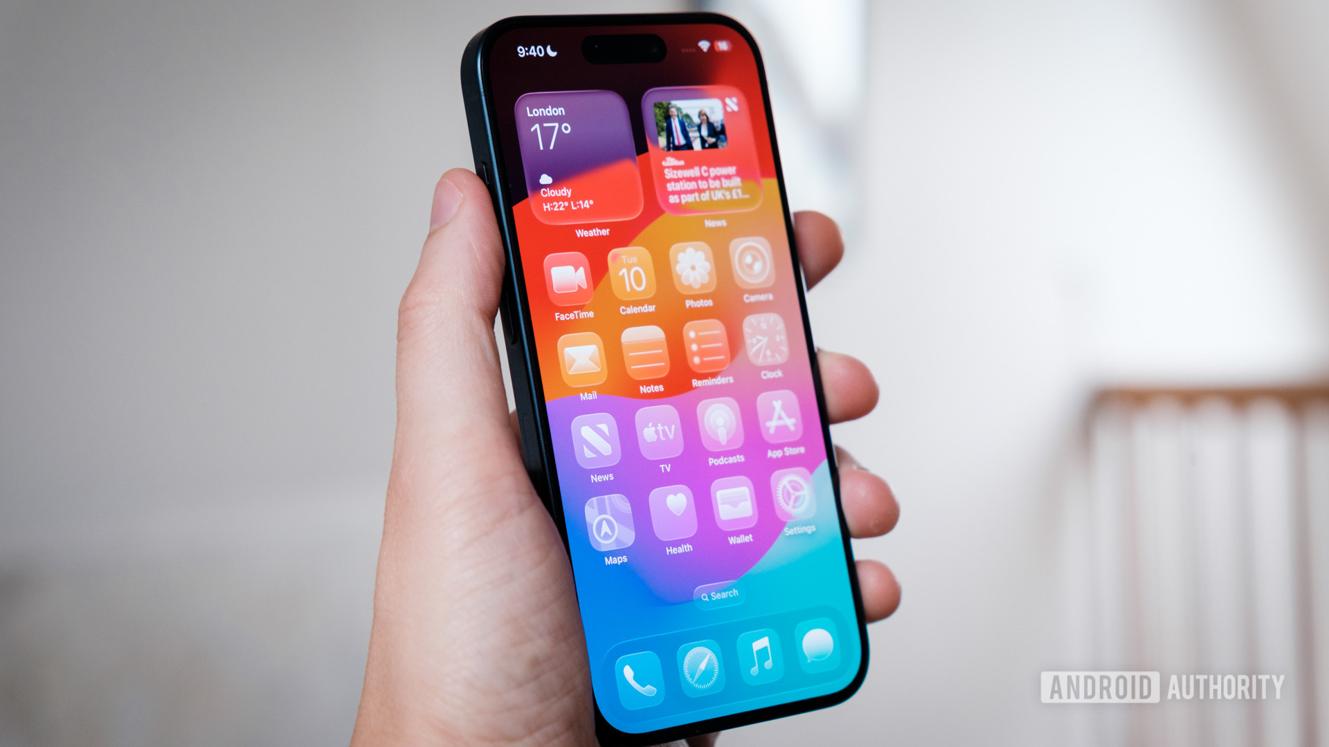
Like Android’s latest redesign, iOS 26 and its new “Liquid Glass” UI are built to be more reactive and responsive to the user’s aesthetic preference. It’s also designed to unify the look across Apple’s product portfolio. However, it falls well short of the mark.
I’m sure you’ve seen plenty of images of it online already, and it’s as positively illegible as everyone says. Excessive use of transparency and refraction makes any overlay menu a headache-inducing mess and, from an accessibility standpoint, it’s a disaster.
Material 3 Expressive might look flat by comparison, but its sensible, configurable color palettes avoid these kinds of jarring clashes and eyesores. It’s easy to read and navigate, and gets the job done with a splash of simple customization.
A UI needs to be functional first and foremost, a lesson Apple has seemingly forgotten with Liquid Glass. Apple seriously needs to dial the transparency back before this ships. In addition, my iPhone 15 Pro has been incredibly hot and chugs down battery life since updating to iOS 26. It’s too early to tell if these graphics-heavy effects are to blame, but there’s a reason Windows ditched Vista’s Aero Glass theme.
Liquid Glass isn’t just headache-inducing, it’s an accessibility nightmare.
Apple also introduced icon theming back with iOS 18 and has a new clear option to really cement its Glass design change. However, the lack of any color deprives icons of instant recognition, making the whole UI harder to navigate. While Google’s color-themed icon efforts aren’t great, at least they’re easily distinguished from the background. Android also provides much smarter custom theming across the UI, making settings and options easy to see at a glance, regardless of your color palette. Apple still doesn’t do that, and its latest glass icons are too hard to eyeball. It’s bad design — plain and simple.
To be fair, the glass effect isn’t terrible when paired with apps that offer mostly solid background colors. Still, using it side-by-side with Google’s latest tweaks, it’s hard not to conclude that Apple isn’t interested in improving functionality. The camera app is a prime example; oversized cartoonish bubbles and a labyrinth of hidden layers have replaced the sleek, easily accessible, camera-inspired layout.
Customization is King

Robert Triggs / Android Authority
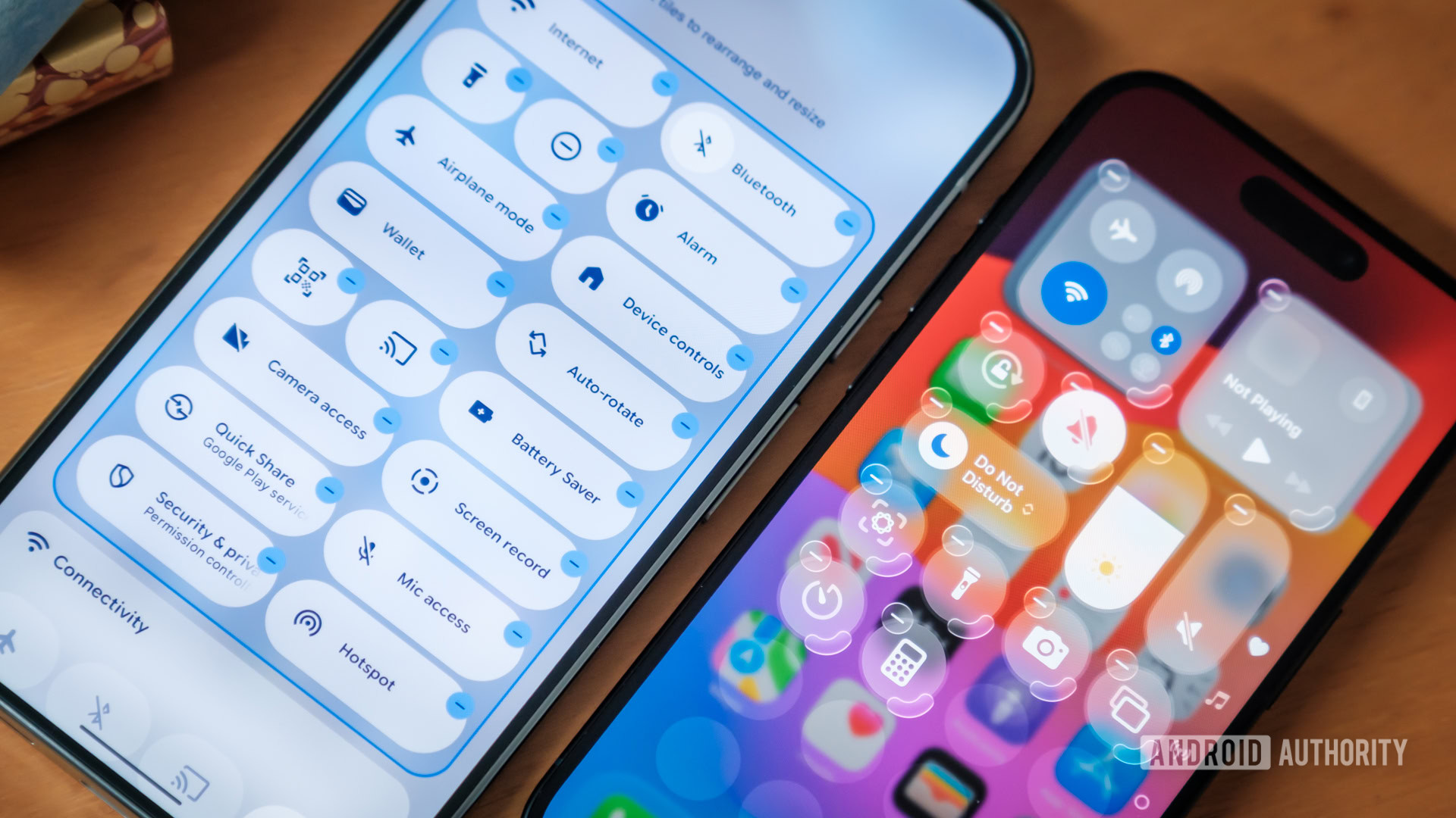
Putting questionable aesthetic choices aside for a minute, iOS 26 apes Material 3 Expressive with its customizable “Control Center,” aka Android’s Quick Settings menu. You can now rearrange and resize icons, allowing you to fit more or less on screen, depending on your needs.
In some ways, iOS 26 allows for even more customization with the ability to stretch toggles both vertically and horizontally. The media center, for instance, can be made taller or shorter depending on how much information you want to display, and even moved around, which you can’t do on Android. However, some toggles can’t be resized in every direction, so again, it can look a mess.
However, Apple’s UI implementation is the real issue for me. Android 16 separates resizing and repositioning by requiring a long-press on the toggle. iOS attempts to do both simultaneously, meaning it’s all too easy to drag instead of resize, causing a Microsoft Word-style cascade of layout chaos. I found it infuriating to use.
Likewise, Android has addressed a significant redundancy bugbear; the Wi-Fi and Bluetooth toggles now directly open a small window for you to configure the required settings. iOS 26 is stuck somewhere between, allowing you to toggle Wi-Fi on/off quickly but not Bluetooth, which requires you to jump through several menus to find the pairing page. Different outcomes depending on press duration or location just add to the madness.
Throwing stones at Apple’s glass house

Robert Triggs / Android Authority
After spending an admittedly short time flipping through the latest versions of Android and iOS, I’ve come away with a significant difference in mind.
While not perfect, Material 3 Expressive is primarily focused on making Android more user-friendly. It’s more customizable, tweaked to present information more clearly, and includes new additions like Live Updates. It’s a quality-of-life improvement to an OS we already like; an upgrade rather than a redesign.
iOS 26, by comparison, is virtually all about appearances. Cherry-pick Liquid Glass on the right backdrop and it looks great, but the update fixes very little of my long-running bugbears when navigating the OS. Customization is marginally better, but still only skin deep and too often breaks its own aesthetic rules. Menus remain a laborious back-and-forth arm wrestle that’s now arguably worse in places, and the glass design hampers rather than helps readability. It’s a lick of paint on a creaking foundation.
A flashy redesign can’t cover up Apple’s lack of AI leadership.
The cynic in me might accuse Apple of trying to divert attention away from its lack of genuine ideas and abysmal state of Apple Intelligence with a shiny new interface. After all, these are the top two improvements in the iOS 26 press kit. However, the implementation is so poor that I am now genuinely concerned about the platform’s direction of travel. Seriously, who let this beta pass quality control?
To quote ex-Apple design chief, Jonny Ive, back at the launch of iOS 7 in 2013: “I think there is a profound and enduring beauty in simplicity; in clarity, in efficiency. True simplicity is derived from so much more than just the absence of clutter and ornamentation. It’s about bringing order to complexity.”
I’ll leave you to decide which modern mobile OS best lives up to that mantra.


